
SkillfulBite.
A mobile app prototype and Smart Fridge prototype that aims to make cooking an easier and more enjoyable experience.
9 min read

Visual Design
Mobile & Fridge
UX Research
My Role
Team Leader, UX Designer, and UX Researcher.
Duration
6 weeks
Tools
Figma
Miro
Problem
Meal Preparation is daunting for new cooks.
Learning to cook can be daunting for many young adults and finding the time to cook and also meal prep is often times overwhelming. Developing intuition around all of these basic skills while also trying to figure out complete recipes can make the cooking process extremely intimidating.
Solution
Streamlining the learning curve of meal preperation
SkillfulBite aims to bridge this gap by providing a mobile app and a smart fridge application for novice cooks to learn the basics of cooking without it being too mentally draining. With features like guided visual and written instructions for recipes to customizing and creating recipes based on ingredients the user already has, Skillfullbite aims to make the process of learning to cook simple and straightforward.
Smart Fridge functionality 🧊
Along with our mobile app, we decided also to make a smart fridge to help users reduce food waste by keeping track of the ingredients they already have.
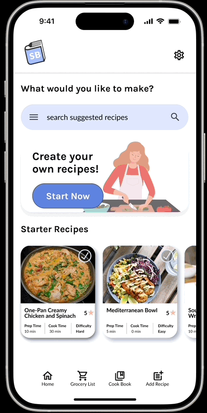
Personalized Instructions 🗒️
Choose between video or written instructions to learn how to cook a recipe based on your preferred learning style.


Create your own recipes 🧑🍳
We all know the feeling when you are trying to find recipes to cook but don’t have all the necessary ingredients at home. Now you can make recipes based on ingredients you currently have!

Organize Meals ✍🏼
Create meal plans and organize recipes into separate categories based on breakfast, lunch, or dinner meals,
Design Methodology
Lean UX
Skillful Bite was developed using Lean UX to ensure we understood our problem space and users’ pain points and explore various solutions before jumping into the deep end. Our team adapted elements of the Lean UX canvas approach to fit our class project's time constraints. We started with a set of assumptions about our problem space to quickly validate and test during a series of two 3-week sprint cycles.

Project Kickoff
How can we make cooking easier and more engaging?
Initial Assumptions - Our team assumed that our primary target demographic would be college students living alone for the first time and not knowing the basics of cooking but finding it difficult to find the time to meal prep. We assumed that they would want a resource to learn how to cook meals but also a way to make cooking less time-consuming and stressful.
Problem Statement - Novice cooks struggle with learning and time constraints when trying to prepare easy, healthy meals, leading to reliance on less nutritious pre-made options.
Proto Persona
Who are we solving this problem for?
Based on our initial assumptions our team decided to create a proto-persona that would help personify our user’s needs and goals. We knew that our initial proto-persona may not be entirely accurate initially but over the duration of our project we would be able to learn more and clearly define and examine what our user’s goals are.

Hypothesis Prioritization
What should we be testing first?
We started to come up with hypothesis statements to validate before we built out our prototype based on our business outcomes, user outcomes, and a corresponding feature for Skillful Bite. The hypothesis statements that we felt fit the bill were :
How might we reduce the amount of food waste and time it takes to cook?
How might we make it easier for users to find relevant recipes?

Sprint 1
Creating an Experiment - Design Challenge
We decided to validate this sprint's hypothesis: “We will achieve smart food usage if Brad can make meals without having to go shopping/do extra meal prep with current ingredients to meal suggestion system.” To test this hypothesis, we created an experiment to see if our users would even be willing to jump right into something without much prior knowledge or background. The reason is that cooking, in general, isn’t a perfect science and takes a lot of initiative as well, so we wanted to see if our users would be willing to do the same. We also wanted to see how resourceful they would be as well and how they would be able to solve a problem that might seem
Experiment Structure - Our experiment consisted of asking our users to create a tangible product based on our prompt which was “design a new method of transportation”. They had a time limit of 15 minutes and were only allowed to use materials that were readily available to them. Attached below are some of the designs our participants came up with.
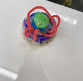
Flying UFO Spaceship

Flying Pirate Ship
Lo-Fi Prototype
Brainstorming potential solutions
We started out with a low-fidelity wireframe while brainstorming ideas before creating a final high-fidelity version. Our low-fidelity wireframe helped us plan how our app would be laid out and function with many moving parts.

Interviews
Validation through Interviews
We decided to interview 3 participants with similar attributes to our target demographic, all of whom were college students with minimal to intermediate experience with cooking. We wanted to see if all of our Lo-Fi features would be helpful to someone with minimal cooking experience.


Key Takeaways
What did we learn in this Sprint?
Thinking on the spot is challenging - During our design challenge experiments, all of our participants expressed that thinking about concept ideas was always the hardest part of the whole challenge. During our post-challenge interview, we also learned that all of our participants sometimes struggle to think of meal ideas and dislike structured recipes because they may not have all the ingredients or tools required.
Positive Reassurance is crucial - Since our participants during the design challenge didn’t exactly know what they had to build since we deliberately kept the prompt open, they said that they would have liked maybe a visual example or some time of reassurance that they are on the right track especially when they are doing something new for the first time including cooking.
Smart Fridge helps fill a specific niche - We also wanted to experiment with the idea of creating a UI for a Smart Fridge mainly because we thought the larger screen size would make it easier to follow along with recipes and because it would be easy to track food expenditure and waste. Our participants also liked the idea, especially since they often lose track of food sitting in the back of the fridge or unintentionally forget about it.
Unnecessary feature cramming - During our usability test this sprint, we got feedback that a lot of our features weren’t detailed enough, and we were casting our net too wide. We needed to close the gap and focus on our core features. As a result, we decided to scrap the “receipt” scanner feature because, during our interviews, our participants indicated that they very rarely keep their receipts anyway.
Sprint 2
Validating our Assumptions
For this sprint, we decided to validate the hypothesis: “We will achieve reduced user drop-off if Brad can follow along without getting overwhelmed with step-by-step written directions.” We wanted to see how we could best retain users, how well users followed directions, and, more specifically, what type of learning style they liked to follow, whether it was auditory, visual, or written instructions.
Experiment Structure - We decided to do a scavenger hunt to see how well participants could handle being in a situation without any prior experience and knowledge, but we also wanted to see which learning methods were the most popular. We interviewed 3 participants, all assigned different difficulties with different time limits as well. Participants would be guided by one of our group members who would give them hints that were either a riddle (written), an audio message (audio), or a vague picture of their next checkpoint (visual).

Scavenger Hunt Map

Experiment Design Table
Hi-Fi Designs
Bringing Skillful Bite to Life
After gathering valuable feedback on our Lo-fi prototype, we decided to start making a high-fidelity prototype, which we conducted a few usability testing sessions so that we could refine our prototype further.
A few screens from our initial High Fidelity Mobile Prototype
Key Takeaways
What did we learn in this Sprint?
There is no one “common” learning style - During the scavenger hunt, we had all of our participants go through the challenge by mixing up learning styles. Although most of our participants said they were visual learners, results were mixed, and we didn’t identify a learning style that seemed more prevalent than the others.
Time and Stress are directly correlated - Participants going into the challenge were assigned a random difficulty level, which was directly correlated with the amount of time they had. Still, they weren’t informed about their difficulty level until after the scavenger hunt was completed. As expected, participants indicated that not knowing how much time they had added more stress during the challenge, and most participants actually overestimated the difficulty level they thought they were assigned.
The light at the end of the tunnel, building up momentum - Participants indicated that they felt that once they got a lot of answers right in a row, it felt like they had a much easier time because of the momentum they built up.
It is the fine print that matters - During our usability testing sessions with our high-fidelity prototype, our users said that there weren’t any ways to find the information they wanted at a glance. For example, they stated they wanted tags or identifiers indicating difficulty level and cook time for specific recipes.
Refinement
The evolution of our proto persona
After our second sprint, we went back in to refine our proto persona based on feedback garnered from our user interview over the course of both sprints and although some of our assumptions were validated we learned about other important things that our users cared about as well.

Refinement
The icing on the cake
Throughout the course of this project, we had to narrow down the scope of our application as well as continuously iterating based on the assumptions that we either validated or invalidated.
1) Changes to the menu bar
After conducting a few usability testing sessions during refinement week, a lot of our users said that the icons were a bit confusing so we decided to adjust the spacing and add labels to them for clarity.
2) Card Layout and Tags
We decided after getting feedback from our user’s that the meal description wasn’t the most important thing when choosing a recipe so we decided to add more descriptive information to make it easier for a user to choose a recipe.
3) Grocery List
The previous iteration of our Grocery List feature included a drop-down menu for each major food group. Still, after usability testing, it was important to ensure that users could see all the information at a glance instead of being hidden. Users said that checking things off a list is something they find satisfying as well.
4) Fridge Home Page
As a team, we were conflicted on whether to use illustrations or more realistic images of food for our app. Our solution actually led us to combine both image varieties so that the instructional and learning features would use illustrations and the actual recipes and cooking material would consist of more realistic imagery.
5) Fridge Recipe Page
For the recipe page I wanted to make it more clear which ingredients would be selected and added into the recipe as well as cleaning up some visual inconsistencies.
6) Recipe Page
Our previous iteration of the recipe page had a bit too much information, and the recipe wasn’t descriptive enough and didn’t have any visuals to go along with the written step-by-step instructions. We also added descriptive tags so that users can quickly at a glance see important information about the recipe, such as cuisine type, difficulty level, dietary restrictions, and time commitment.
7) Deleted Features
When initially creating designs for potential features that the app would have, we realized that throughout various iterations and usability testing, some of the features we were building were either out of scope for our application or just didn’t make sense for what Skillful Bite was trying to achieve. We decided to take out the receipt scanner page, the account brief page, and the pickup for grocery store delivery page.


Primitives
Creating a Design System
Primitives are the basic values used and serve as the building blocks for establishing a design system. I created 3 color groups: Brand, Neutrals, and Semantics (colors associated with success, warning, error, and information).

Tokens inherit their values from primitives as listed above and are the semantic values that indicate how the primitive values should be applied.

Design System
Light and Dark Mode

Design System
Bringing SkillfulBite to Life

Finalized Designs
Introducing Skillful Bite!
A mobile app and fridge prototype that aims to help young adults learn to cook and meal prep.

Conclusion + Learnings
What would I do differently?
Skillful Bite was my second time being a team leader for a group project. Collaborating with a highly motivated team throughout the entire process, from conducting research to creating prototypes, was an incredibly rewarding experience that made all the challenges and obstacles we encountered along the way worthwhile.
Be willing to experiment - Even though I had a general idea of the problem space this app would be in. I think it was important that when brainstorming solutions, we were willing to think about out-of-the-box solutions like the smart fridge, for example, and I wish we had pushed the boundaries of the smart fridge idea even more if we had more time.
The importance of alignment - It is essential that the whole team is on the same page, especially since our sprint cycles move so fast, and we have essentially six weeks to deliver a final product. As the team leader, I had to organize meetings and set a roadmap for the team.
Rapid iteration can be extremely valuable - Lean UX, in general, was something that I did not have exposure to prior to this project and was a drastic shift from Goal-Directed Design, but it helped us know if our assumptions were validated or not so that we knew ahead of time if certain features needed further refinement or needed to be scrapped entirely.