
uniVRsal.
A VR-based prototype that aims to educate designers about learning ways and finding resources about how to design with accessibility in mind.
7 min read

UI Design
Virtual Reality
UX Research
My Role
Individual Project - Sole Designer and Researcher
Duration
8 weeks
Tools
Figma
Photoshop
Problem
Finding resources to design for accessibility is challenging.
Accessibility is often not highlighted in design curricula in higher education. Often times it is difficult to find resources about learning how to design for accessibility and in some corporate settings the topic of accessibility is discussed superficially.
Solution
Creating a hub for designers to learn about accessibility.
uniVRsal aims to help designers not only learn more about how to design for accessibility but also how to implement what they learned into their designs as well making uniVRsal an active form of learning.
Sneak Peek
Create your own color palettes

Sneak Peek
Learn with a Community

Sneak Peek
See what works and what doesn’t

Project Kickoff
Laying out the ground work
I first started out by creating a few sketches of my initial design ideas for uniVRsal. Something that I found challenging was designing for Virtual reality is drastically different than other modalities, and there weren’t a lot of previously available resources either.


Lo-fi Prototype
Brainstorming potential solutions
After having a few initial sketches and ideas in mind, I started prototyping a few low fidelity screens. My initial ideas revolved around displaying different UI designs from different categories of apps or websites and have examples that either were or were not designed for accessibility in mind. I decided to pivot mainly because just looking at UIs was a form of passive learning which isn’t as effective as active learning and actually interacting with the interface directly.

Mid-Fi Prototype
Seeing what sticks
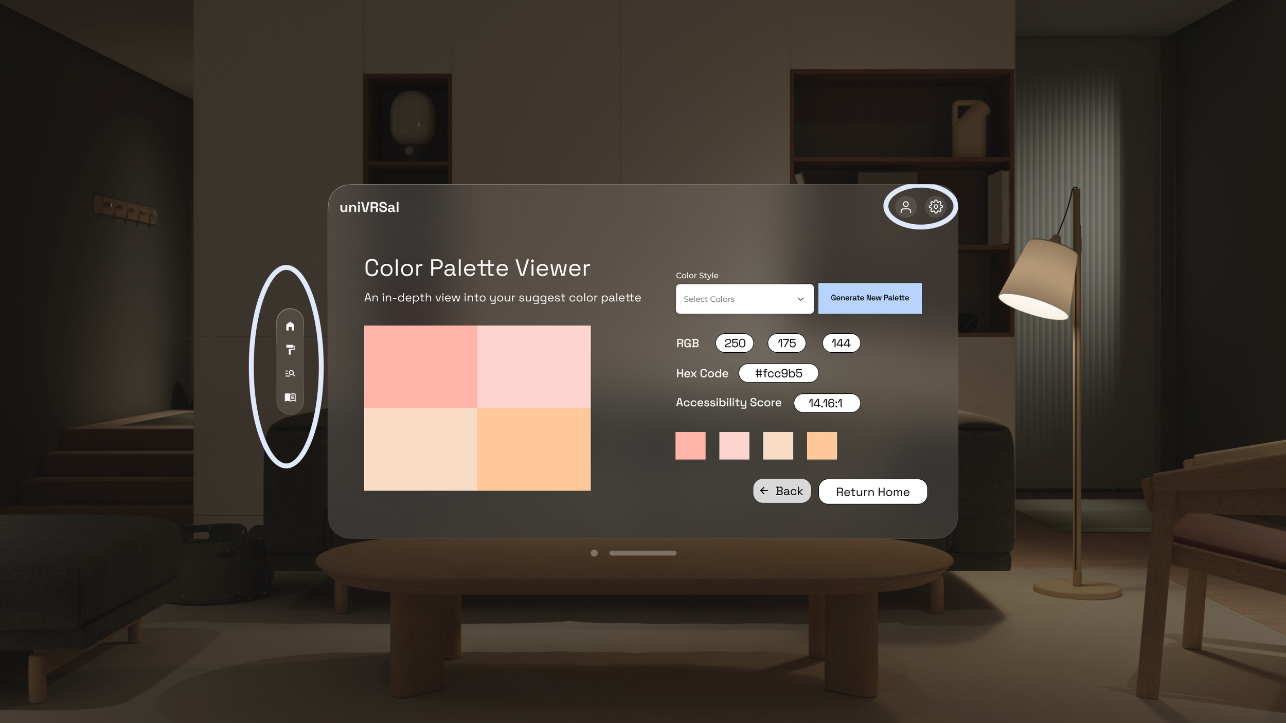
After pivoting, I decided to continue on with the color palette feature and let users select different palettes and see how accessible they were and find ways to implement it into their designs. This is because a lot of the feedback I got from my initial protoypes was that finding a color palette and making sure it is accessible is very time consuming and there is a huge paradox of choice and simplifying that whole process would make it easier for designers to easily incorperate an accessible color palette into their designs.

Hi-Fi Prototype
Bringing uniVRsal to life
Going into the high fidelity designs, some of the feedback I got was that it wasn’t just enough for designers to know what colors and typography were accessible or not because they also wanted to know why certain color combinations were accessible, and they also wanted other ways to learn about accessibility through resources such as articles or potentially even mentorship.

Refinement
Application of Psychological Terms
Miller’s Law
The average person can only keep 7 + or - 2 items in their working memory at a time which is why you can only scroll through a few cards at a time
Chunking
The menu items, for example, are chunked so that the user knows what type of media they will encounter based on category instead of displaying every single item, article, and course on the same screen.
Prior Knowledge
Previously acquired knowledge about accessibility standards from the color palette selector is displayed on the color guidelines page to give more context for the user.
Schema
The profile and settings icons are universal icons so the users already likely know what both of those icons signal and how they will function based on previous experience
Law of Proximity
Objects that are closer together tend to be associated with each other. I added the tags, descriptions, and titles in my card element to ensure all sub-elements felt like they belonged together.
Von Restorff Effect
Elements that are different tend to stick out more than elements that blend in. The generate new palette button, for example, sticks out compared to other elements on the page.
Signaling Principle
Users will be able to learn better if there are signals or visual cues that show how information is structured. In my design, you can see how the check marks, for example, signify whether the accessibility score is sufficient or not.
Fitt’s Law
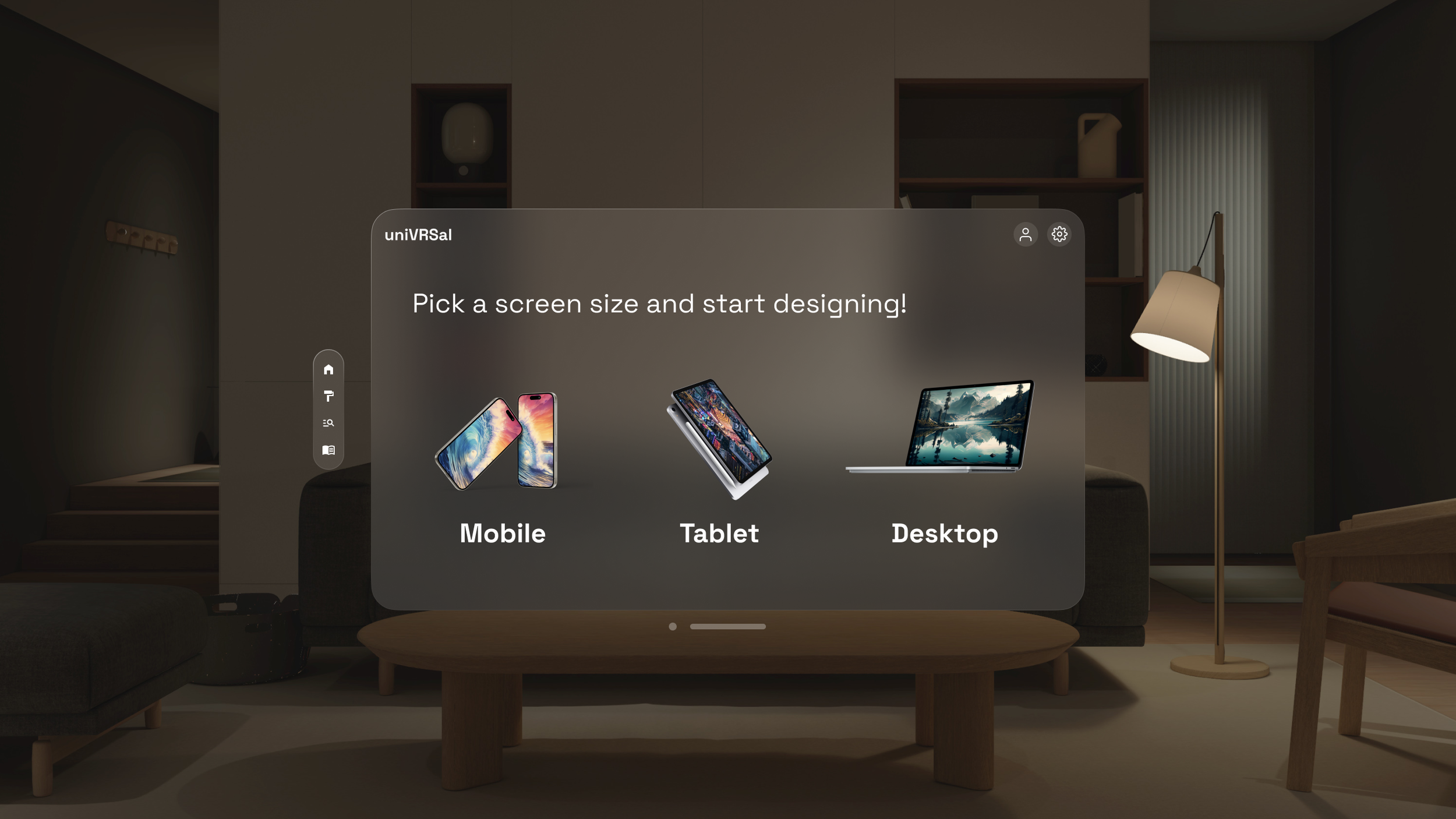
The time to click on a target is a function of its size and distance away. On this screen the clickable mobile, desktop, and tablet options are much larger than the rest of the functional icons
Coherence Principle
It is important to exclude extraneous information if possible. I did this throughout my design and one example in particular is only including relevant info for the color selection feature.
Hick’s Law
The time it takes to decide increases with the number of alternatives and options. I adhered to this law by only showing a few color palette options initially.
Convention
It is important to adhere to certain design conventions so that users can easily navigate through your designs. I stuck to conventions by using universal icons and an addition of a nav bar.
Jakob’s Law
Since users spend most of their time on other applications, they prefer that other designs adhere to similar conventions, since I was designing for VR I decided to adhere to apples Vision Pro OS interface to ensure my designs were consistent.
Spatial Contiguity Principle
Words and visuals that relate together should be close together. In my design, I show this by including the image of the mentor but also their qualifications and bio in the card as well
Multimedia Principle
Combining visuals and written content in tandem is more effective in general. In my design, I opted to not only show color contrast but explain how it is rated based on WCAG standards as well.


Finalized Designs
Introducing uniVRsal!
A virtual reality prototype for designers to learn more about accessibility.

Conclusion + Learnings
What would I do differently?
uniVRsal was my first solo design project, exploring and learning how to design for a Virtual Reality modality, and I learned many things along the way.
Be willing to experiment - Even though I had a general idea of the problem space this application would be in. I think it was important that when brainstorming solutions, we were willing to think about out-of-the-box solutions, and I was happy that I could pivot the direction of this project.
Designing with intention - This project especially was a lot different than other projects I worked on because we were required to apply psychological principles and heuristics into our design which has really broadened my horizons.